Creswood Corners Brand Identity
Creswood Corners Brand Identity
Complete corporate identity design for a multi-venture family business, including logo design, stationery suite, and cohesive branding across fireworks, outlet, and armory divisions.
Visit Website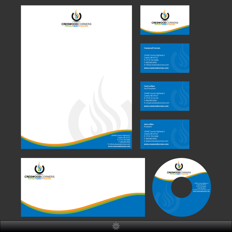
Technologies Used
The Challenge
Creswood Corners needed a unified brand identity that could work across multiple business ventures (fireworks, collectibles outlet, and armory) while maintaining a cohesive family business feel. The brand needed to be memorable, professional, and adaptable to various applications.
Our Solution
We developed a distinctive flame motif logo featuring vibrant green, blue, and orange flames that symbolize energy and excitement. The identity system includes letterhead, business cards for multiple team members, envelope designs, and CD labels. The flexible design allows for sub-brand variations while maintaining brand recognition.
The Results
The unified brand identity strengthened customer recognition across all three Creswood Corners locations. The professional stationery suite elevated the business image, and the adaptable logo system successfully launched the Fireworks, Outlet, and Armory sub-brands with consistent visual identity.